How does packaging influence a product’s success?

Evelyn
Customer Success Manager
Hi! I’m Evelyn from Hipack.
I’m passionate about creating high-quality, custom packaging that makes your brand stand out. I’ve worked with luxury brands and jewelry distributors worldwide to deliver packaging that’s not only beautiful but also functional. Let’s dive in!
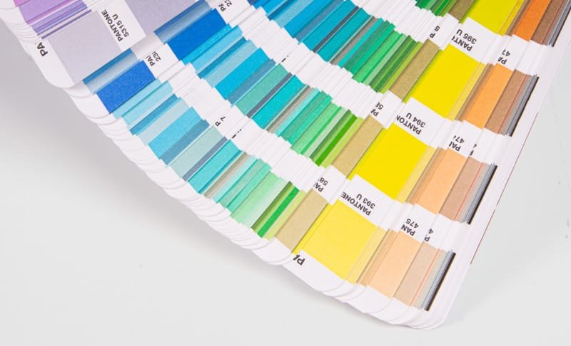
When it comes to luxury packaging, the colors you choose are more than just eye candy—they’re the first impression, the silent ambassador of your brand’s identity. The right shade can speak volumes, setting the tone for everything your product stands for. Let’s dive into how color can elevate your packaging design and reflect luxury at its finest.
Color is not just an aesthetic choice; it’s a powerful tool that speaks to the soul of luxury. With the right hues, you can evoke a sense of exclusivity, sophistication, and elegance. But how do you select the perfect palette? Let’s explore some key strategies for using color to make your luxury brand shine.
In this article, we’ll walk through proven strategies for using color in luxury packaging, from effective design approaches to the latest color trends in 2024. Let’s get started!
Effective packaging design strategies for luxury brands
How do luxury brands use color to communicate their values?
Effective design strategies in luxury packaging involve more than just choosing pretty colors—they tell a story.
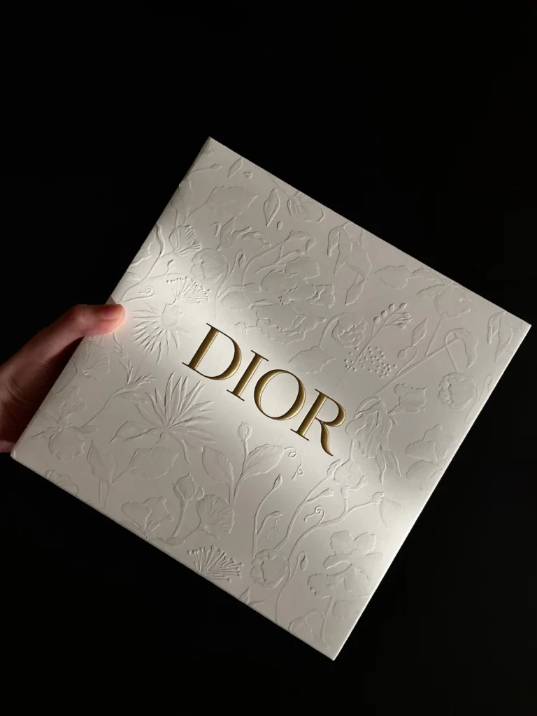
Effective packaging design for luxury brands starts with understanding the emotions behind colors. Each shade can trigger a response, whether it’s trust, elegance, or desire. To truly reflect the luxury essence, it’s crucial to go beyond popular color trends and focus on your brand’s core values. For instance, using deep, rich tones like navy blue or black1 signifies sophistication and timelessness. These colors are often seen in luxury branding because they represent strength and exclusivity.
Key Design Elements for Luxury Packaging
When designing packaging for a luxury product, it’s essential to consider:
- Minimalism: Simple designs with clean lines and space allow the product itself to shine.
- High-quality materials: Use textured finishes like matte or glossy to add a tactile element to the color.
- Contrast: A high contrast between background color and logo can make your packaging stand out.
Color, when used strategically, can communicate more than just a brand’s image—it speaks directly to the customer’s emotions.
How color influences luxury brand perception
Can color really impact how consumers perceive luxury? Absolutely.
Color can shape perceptions and influence buying decisions.
When people look at luxury products, they don’t just see a pretty design—they feel something. Colors like gold, silver, and black immediately signal high quality and sophistication. These are colors that say, “You deserve the best.” On the other hand, lighter, softer shades like pastels might make the packaging feel more casual and approachable, which could weaken the perception of luxury.
The psychology behind color is powerful, and luxury brands leverage this to their advantage. For example, Chanel’s use of black and white creates an instantly recognizable, sleek, and high-end image. In contrast, Tiffany’s signature robin’s egg blue is so iconic it has become synonymous with luxury itself.
The Impact of Color on Customer Trust
Using metallic accents in packaging design
Why should you consider adding metallic accents to your luxury packaging?
Metallics elevate your packaging and enhance the feeling of luxury.
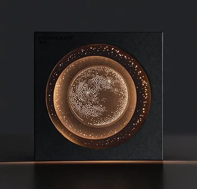
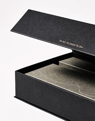
Metallics, such as gold3, silver4, or copper, are not just for jewelry—they are also perfect for luxury packaging. These accents can give your design a rich, opulent touch that grabs attention and makes the product feel even more special. Think about how a gold foiled logo or silver embossing stands out against a matte black box. The contrast is striking, and the metallic finish creates a sense of exclusivity and high quality.
Why Metallic Accents Work in Luxury Design
Metallic elements are associated with premium products because:
- They reflect light, drawing attention to key details.
- They give a sense of grandeur and wealth.
- They evoke feelings of sophistication and timelessness.
The combination of metallic accents with bold colors is a proven strategy for luxury packaging that never goes out of style.
Color palettes for premium products
What’s the best color palette for a premium product?
The right color palette is crucial for setting the right tone.
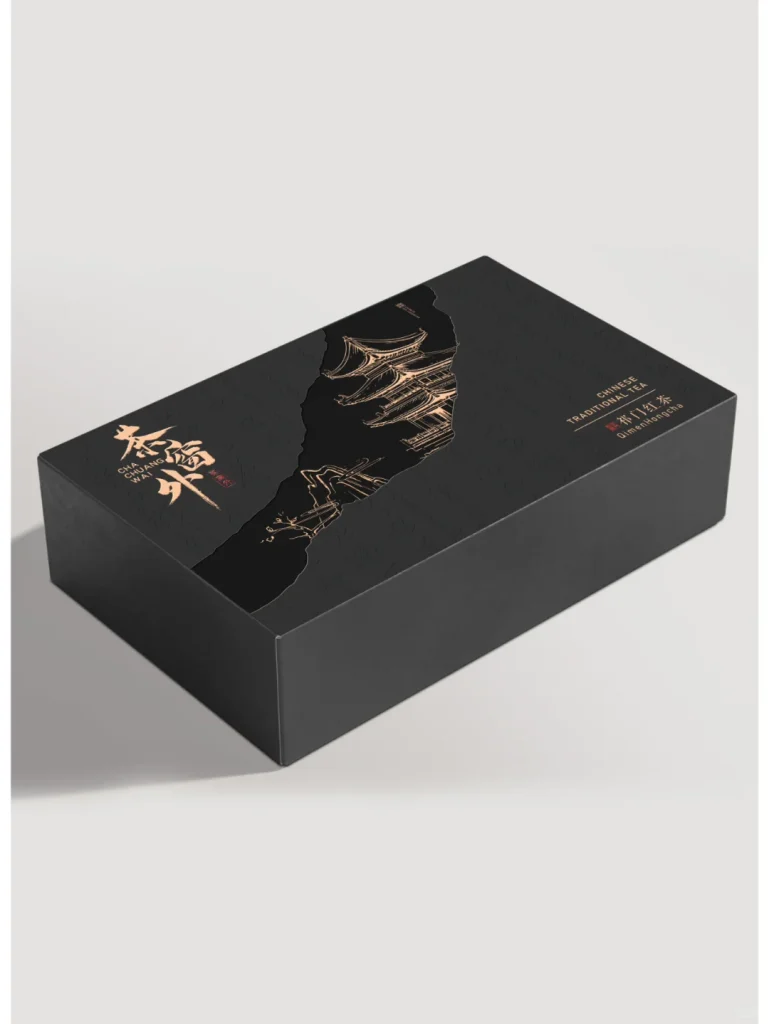
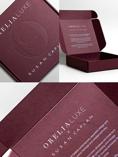
When curating color palettes for premium products, it’s important to consider the message you want your brand to communicate. Rich, deep tones like burgundy, navy, and emerald green are often used in luxury branding for their association with wealth and sophistication. These colors evoke a sense of exclusivity and rarity, which is exactly what luxury buyers are after.
You don’t have to follow trends—establish a timeless palette that aligns with your brand values.
Premium Palette Recommendations
| Primary Color | Secondary Color | Accent Color |
|---|---|---|
| Navy Blue | Gold | White |
| Burgundy | Silver | Black |
| Emerald Green | Cream | Rose Gold |
Examples of Premium Color Palettes
These combinations can enhance the perceived value of your product and make it stand out in the competitive luxury market.
Luxury Brand Color Palette 2024 Trends
What are the top luxury color trends for 2024?
The luxury color palette for 2024 is all about bold choices and sophisticated contrasts.
This year, expect to see vibrant, daring hues alongside timeless classics. Metallics will remain a staple, but deep, earthy tones and jewel tones like ruby red and sapphire blue6 are making a comeback. Luxe brands are also experimenting with minimalist palettes, focusing on monochromatic schemes that allow the product to be the focal point.
2024 Color Trends to Watch
Deep jewel tones: Ruby, sapphire, and amethyst.
Earthy tones: Olive, terracotta, and charcoal.
Monochrome schemes: Play with various shades of a single color.
The goal? To stand out while maintaining elegance, and to give consumers a fresh experience that still feels luxurious.
Color Scheme Comparison
| Scheme | Colors |
|---|---|
| Deep jewel tones | Ruby, sapphire, amethyst |
| Earthy tones | Olive, terracotta, charcoal |
| Monochrome schemes | Various shades of a single color |
Making Your Brand Shine with the Right Color Choices
What’s the secret to making your brand stand out in the luxury market?
Choosing the right colors is about telling your brand’s story and making it unforgettable.
With the right color strategy, you’ll ensure that your packaging speaks for itself—elevating your product’s appeal and aligning it with the values your customers hold dear. Think about how Chanel’s classic black-and-white packaging resonates with customers. Or how Tiffany & Co.’s blue box7 feels like opening a treasure chest.
It’s not just about beauty. It’s about making your customers feel something deep inside. Luxury is all about evoking emotions, and color is your most powerful tool for that.
Conclusion
Color isn’t just a visual choice—it’s a language. When you choose the right shades, your packaging can speak volumes about your brand’s elegance, sophistication, and exclusivity. In 2024, remember that your color choices are your first conversation with your customers—make it count.
I’ve added links to "navy blue" and "black" because these colors are widely used in luxury branding to convey sophistication and exclusivity. By understanding the emotional impact of colors like navy blue and black, you can better communicate your brand’s values and make your packaging more compelling. These colors aren’t just design choices—they evoke trust, elegance, and a sense of timelessness, which are key to attracting luxury consumers. ↩
I’ve added links to the keywords "gold" and "black" because these colors play a significant role in luxury branding. When you see these colors on high-end products, they are not just there for aesthetics—they convey messages of exclusivity and sophistication. Exploring more about these colors can help you understand why luxury brands like Chanel use black, or how gold can be a symbol of wealth and high quality. ↩
Adding gold to your packaging design creates an immediate sense of luxury. It’s not just a color but a symbol of wealth and exclusivity. This is why it’s often used in high-end packaging, where you want to leave a lasting impression of sophistication. ↩
Silver accents in packaging evoke feelings of elegance and modernity. It’s a versatile metallic color that can be used in various designs to create a sleek, contemporary look, making the product appear high-end and sophisticated. ↩
Adding the links to the phrases "navy blue with gold" and "burgundy and silver" will allow readers to explore specific examples or studies on how these color combinations influence the luxury market. By linking to relevant external resources, you provide more depth and credibility to the color palette suggestions, helping readers understand why these choices are popular in premium branding. ↩
Ruby red and Sapphire blue are important color trends in luxury branding for 2024, bringing a combination of rich, classic tones and vibrant, striking contrasts. By linking to these colors, we provide readers with deeper insights into how these colors are being used in design for high-end products. Whether it’s for a branding reimagining or exploring deeper color psychology, these links can offer additional context and showcase their growing presence in the luxury market. ↩
I added links to Chanel’s black-and-white packaging and Tiffany & Co.’s blue box because both examples are perfect illustrations of how color choices can reinforce a luxury brand’s identity and emotional connection with customers. These two examples are iconic in the luxury industry, and by exploring them further, you’ll understand the powerful role that color plays in evoking emotions and enhancing brand appeal. ↩
Send Us A Message
Share:
More Posts
Innovative Mooncake Packaging Box with Pantone Color Trends
Transform your mooncake packaging into a display stand with HiPack’s innovative design! Collaborating with a food company, we used the latest Pantone color trends to create a vibrant and versatile packaging solution.
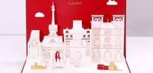
Cartier’s 3D Promotional Cards with Voice Recording
Blog post excerpt [1-2 lines]. This text is automatically pulled from your existing blog post.
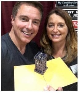
Custom 3D Popup Cards for BBC’s Sci-Fi Series “Doctor Who”
HiPack created custom 3D popup cards for BBC’s “Doctor Who,” featuring the iconic police box.
HiPack utilized laser cutting for precision and upgraded printing technology for vibrant images. The result is high-quality, collectible cards that capture the essence of “Doctor Who.”
High-Cost Specialty Paper for Italian Export Project
Blog post excerpt [1-2 lines]. This text is automatically pulled from your existing blog post.