Custom Packaging Guide: How Brands Should Start Before Requesting a Quote
Many brands ask for a packaging quote too early. I understand why. They want a fast price, a clear supplier, and less risk before spending money. Before requesting a quote for custom packaging, brands should prepare product size, product weight, target quantity, logo artwork, reference photo, delivery country, and sales channel. These details help a
Corrugated Packaging vs Rigid Boxes for Ecommerce Brands
Many ecommerce brands think corrugated boxes are only brown shipping cartons. I do not see it that way. A well-designed corrugated box can protect the product and improve the unboxing experience. Corrugated cardboard packaging can be used as mailer boxes, tear-strip boxes, shipping cartons, and premium ecommerce outer boxes. When printed cardstock is mounted on
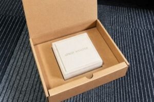
Bracelet Box Manufacturer Guide: Inserts, Velvet and Premium Presentation
As a bracelet box manufacturer, I know buyers often worry about sample proof, insert fit, velvet quality, and delivery time. A good bracelet box should protect the jewelry, present the brand clearly, and make the first custom order feel safer. A good bracelet box manufacturer should explain structure, insert, velvet, logo process, sample proof, lead
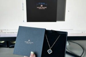
Cosmetic Display Boxes: Retail Presentation vs Shipping Protection
Beauty packaging has two jobs. It must make people stop and look. It must also protect the product before it reaches the shelf. Cosmetic display boxes are not only decoration. A good display box helps beauty products stand upright, stay organized, and look more valuable in retail. But it also needs the right board, insert,
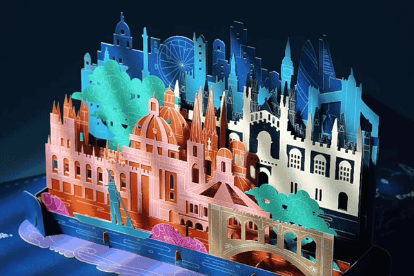
Hey there! I’m Libby from HiPack in China. Our 3D popup cards1 are little treasures, and I’m excited to share how we keep them perfect for your clients—every single time.
Our 3D popup cards must be spotless—no scratches, perfect printing2, tight assembly, and matching the sample exactly. It’s how we make your customers smile!**
Ready to peek behind the scenes? Let’s chat about what makes these cards special.
What does ‘perfect’ mean for a 3D popup card?
Hi! Perfection’s my obsession at HiPack. A card isn’t just paper—it’s a moment, and we check every detail to make it shine.
A perfect 3D popup card has no damage, crisp printing, snug assembly, and mirrors the sample. It’s built to impress your buyers!
Let me tell you about my first big moment with a card. It was for a jewelry buyer in Singapore. I held that card—smooth, no smudges, edges sharp—and I knew it had to be flawless. When they opened it, their gasp said it all. “Libby, it’s gorgeous!” That’s why we sweat the small stuff.
Here’s how we do it:
- Condition: No dents or creases. I run my fingers over every card—call it my personal test.
- Printing: Colors pop, no stray ink. It’s like painting a tiny masterpiece.
- Assembly: Everything clicks tight. A loose piece? No way—it’s gotta hold.
- Sample Match: It’s our promise. If it’s off, it’s not leaving my factory.
Why Bother?
One flaw—like a scratch—can ruin the magic. Imagine giving a gift that’s chipped. Ugh, right? But when it’s perfect, it’s joy in their hands. I’ve seen buyers in North America light up over a card that felt just right. It’s not just business; it’s trust.
Here’s a quick peek at our checklist:
| Check | What We Look For |
|---|---|
| Damage | No scratches or dents |
| Printing | Bright, clean, no spots |
| Assembly | Snug and sturdy |
| Sample Match | Identical every time |
It’s simple, but it works. What do you think—would your clients notice that care?
Why is printing such a big deal?
Printing’s the heartbeat of our cards. It’s not just ink—it’s the first hello your customer gets.
Printing needs perfect colors, no smudges, and sharp alignment. It’s what makes our 3D popup cards stand out!
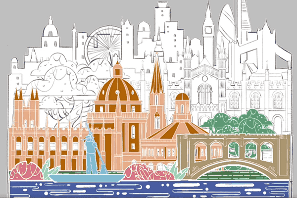
I’ll never forget a Japanese buyer who wanted this exact shade of blue. Five tries—five!—and I was sweating. Finally, we nailed it. They bowed and said, “Libby-san, arigato.” That blue wasn’t just color; it was respect. Printing’s our handshake, and it’s gotta feel firm.
Here’s the breakdown:
- Color: We match it with charts—nerdy, but it works.
- Cleanliness: No ink blobs. Clean cards, happy hearts.
- Alignment: Straight as an arrow. Misaligned? It’s a no-go.
The Details Matter
I keep Pantone swatches by my desk. Silly? Maybe. But when a luxury buyer in Korea asks for gold foil, I’m ready. Ever matched a color so well it felt like a win? That’s me, grinning like a kid.
Printing’s where we show off. A smudge can dull the sparkle—imagine a jewel box with a faded lid. Nope! We tweak, test, and tweak again. Our five production lines hum to get it right. For big buyers—like jewelry distributors—it’s not just a card; it’s their brand shining through. How does your packaging say hello?
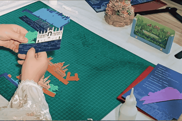
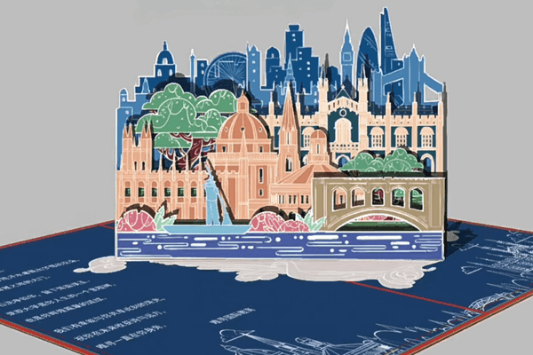
How do we keep the 3D parts solid?
Assembly’s the fun part—where flat paper turns into a tiny stage. It’s gotta be tight and right.
3D parts must be glued neatly, snapped tight, and match the sample. That’s how our cards come to life!
Picture this: I’m watching our team build a card with a mini Eiffel Tower. Click, click—perfect. Then one wobbled. My heart sank! We fixed it, and now we double-check every snap. That wobble taught me: solid assembly isn’t optional.
Here’s the magic:
- Gluing: Just enough—no mess.
- Snaps: Tight, no flops.
- Match: Sample’s the boss.
The Big Why
A loose bit ruins the show—like a puppet with cut strings. Sad, right? But when it’s snug, it’s a wow moment. I’ve seen a buyer in Japan unfold one and whisper, “Beautiful.” That’s the goal.
Our factory’s lines churn out thousands million, but each card gets a once-over. For luxury clients—like those jewelry folks—it’s gotta feel premium. Ever had a gift fall apart? Disappointing. We glue with precision, snap with care, and test like it’s for my own family.
| Step | How We Nail It |
|---|---|
| Gluing | Tiny drops, no spills |
| Snaps | Firm clicks, no wiggles |
| Sample Check | Side-by-side every time |
It’s hands-on, and I love it. What’s your favorite part of a popup card?
What happens if a card doesn’t match the sample?
The sample’s my guide—my North Star. If a card’s off, it’s not going anywhere.
Every card must match the sample—colors, feel, everything. If it doesn’t, we redo it. No exceptions!

A Korean luxury buyer once sent a sample with gold foil. One batch shifted—tiny, but they caught it. I blushed, apologized, and we added extra checks. Now, they trust us. Mistakes sting, but they make us better.
Here’s how we stick to it:
- Comparison: Sample and card, side by side.
- Details: Every texture, every hue.
- Client Wishes: Special requests? Done.
Trust in Every Fold
I tell my team, “Make it like it’s for your grandma.” Cheesy? Sure. But it’s love in action. A mismatch isn’t just a flaw—it’s a broken promise. We’ve built trust with buyers in Singapore, Japan, everywhere, by matching samples down to the dot.
Once, at an exhibition, a buyer held our card next to their sample—silence, then a nod. That nod? Gold. For big companies, it’s their logo, their story. We redo batches if we must. It’s not cheap, but trust isn’t either. Ever had a supplier let you down? I won’t be that one.
Conclusion
Hi! I’m Libby, and at HiPack, our 3D popup cards1 are made with care. Want to delight your clients? Email me at sales@hipackmfg.com or visit www.hipackmfg.com—let’s chat!